CASE STUDY


Client:
Digital Imaging class
Project Title:
Imaging 101
Duration:
Spring Semester 2019
Team:
Designed & Created by Erik Tepan
Description:
Over the entirety of this course three variations of art were made based on our own chosen subjects.
1- Hyper-Realism: A genre that includes painting and sculptures that resembles high res photos, often depictions of real life done in an unusual manner.
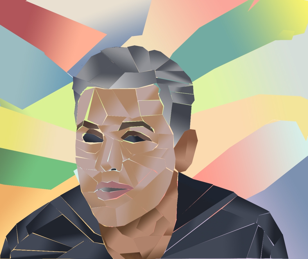
2- Cubism- The basis of this art form involves perspective with a single viewpoint. The form is unnatural and more geometrical.
3- Type & Motion- N/A
Research-
Hyper- The idea really came the currents new about the environment and how we are destroying it slowly and not to doing enough to change that.
Cubist-This idea was inspired the Artist Riel Benn. His cubist art portraits lead me to use a notable athlete to be used. The colors where taken from the skateboards I own and used in the gradients.
Challenges-
Hyper– The main challenge was creating an image that truly convey my message about environmental destruction. The original final had failed to do that while looking incomplete and the absences of something to it. I took time away from physical touching and came back to it once I thought of what to do. My adjustment to the final include erasing certain images, use of more color, and color touch ups.
Cubism- My main issue here was over thinking what i wanted to create. I aimed to add a lot of detail (most unnecessary) where instead I should’ve focus on image as whole. I slowly started taking out what wasn’t needed and put in place and simpler layout. Patterns were all over the place and my portrait couldn’t really be made, i switched to colored gradient going in different directions.
Strategy–
Both projects of are different subjects.
Hyper- This image is defines as unrealistic with the obvious use of object that belong in initial image. Simply and wide shot of mountains before was added crane, rubble, a city, and color changes. To achieve the grayness, the blending had to adjusted and the hue/saturation. The shape of the rubble the crane on matched mountains outline and it cut off where land and ocean met.
Cubism- The Lasso polygon tool was the main tool that form form all the shapes created the background and head shot. The color were made using the gradient tool and the colors were taken of a reference image using the eye drop tool. During the process of cutting all shapes grouping had to be done for organization and efficiency.
Design Approach:
These two assignments were made all in Photoshop with the use of images and inspiration from the internet. Each had its own color scheme that were effective.
Effectiveness
Hyper- This image was intended to show the gravity of environmental destruction by showing a physical demolish of a mountain side. The use of color also emphasizes the despair with the main color gray overtaking the rich healthy blue on the left. The man depicts much of humanity that won’t do much as these events occur.